Table of Contents
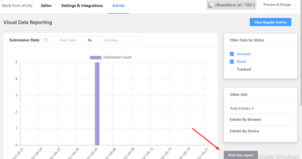
You can have a nice visual view of submitted form entries using the WP Fluent Forms. Not only that, there are three types of visual representation available, Pie Chart, Bar Chart, and Column Chart. This way You can easily get an overview of your total submitted form at a glance.https://www.youtube.com/embed/P3Z2h0XbZZc
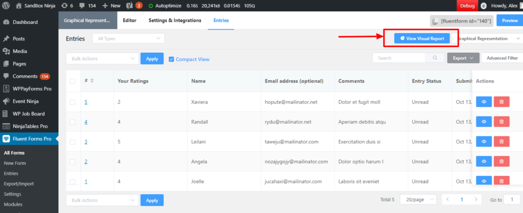
View Visual Report #
To view the visual report, follow one of the following paths:
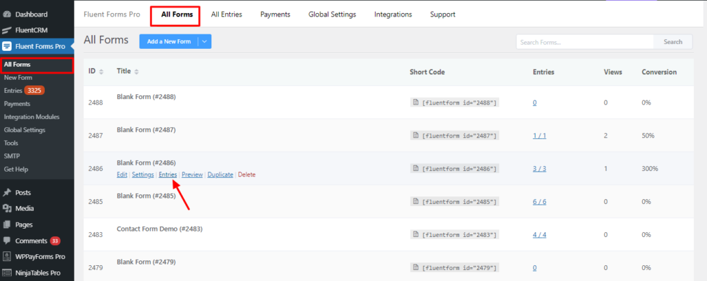
- Go to WP Fluent Forms (sidebar)> All Forms> Entries (Below each form).
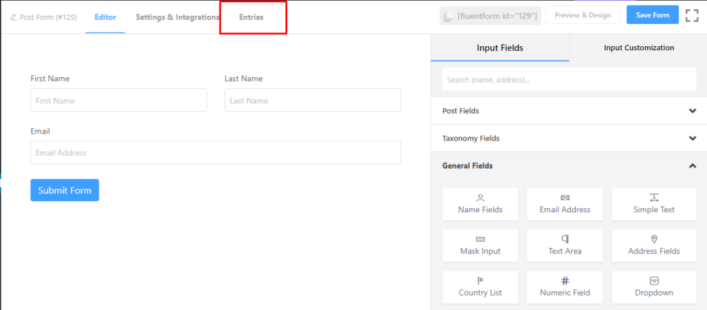
- Or click Edit below the form you are dealing with, and click Entries on the top bar.
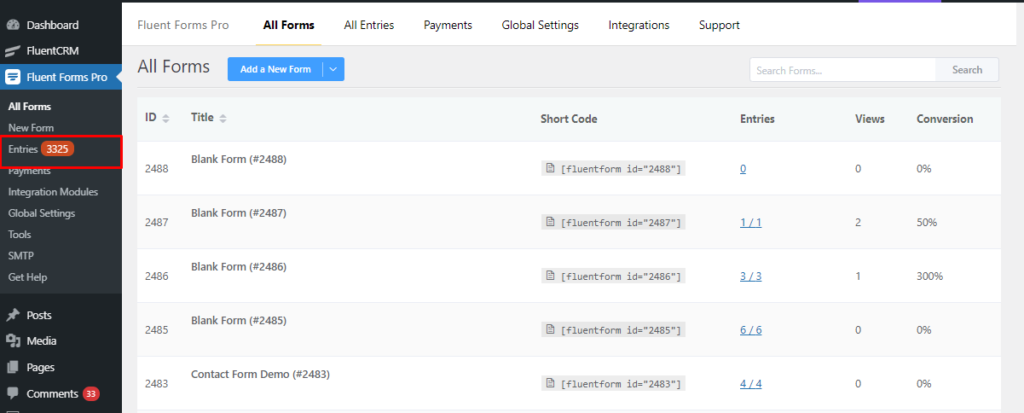
- Or you can go to WP Fluent Forms (sidebar)> Entries and then select the form from the drop-down menu to see the entries for that particular form.
- Then click on the visual report.
- Here you can view the total submitted result of input options and the percentage of every input submission.
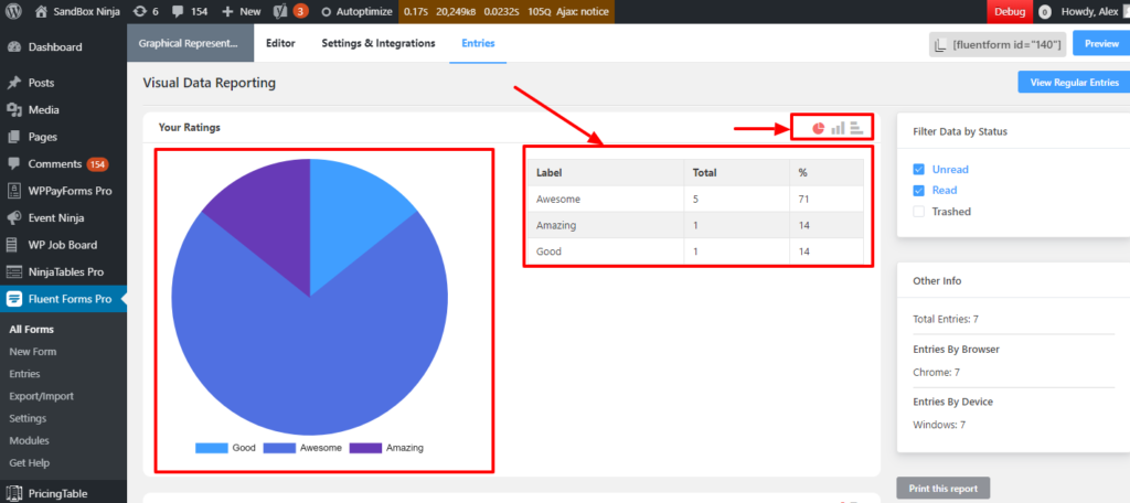
- The default visual representation is the Pie Chart. Your input values are highlighted in different colors. You can also change the visual view with Bar Chart and Column Chart
- Other info sections will show the total number of form entries, the browser that was used during submission, and the device name. You can also print the visual report.